Data Viz Toolkit

Owl Labs puts together an original research report focused on remote and hybrid work every year. With each iteration, the scope of the report has grown — more questions, more markets, and more insights to depict. When it came time to put together the 2022 report (our biggest yet), the design and development processes we had used in the past were simply not adequate for the scale of the data.
So, we decided to standardize…and thus the Data Viz Toolkit was born! I designed this library of standardized chart types (for both desktop and mobile) utilizing simple, readable styles to make every phase of the report production process — writing, design, and development — quicker and easier. The toolkit’s debut in our State of Remote Work 2022 report resulted in the following feedback from the team:
“The chart library made things run so smoothly from content to design to dev.”
“The much closer working relationship with dev + design, even through QA, made the whole process very smooth.”
“Seamless” compared to past reports
-
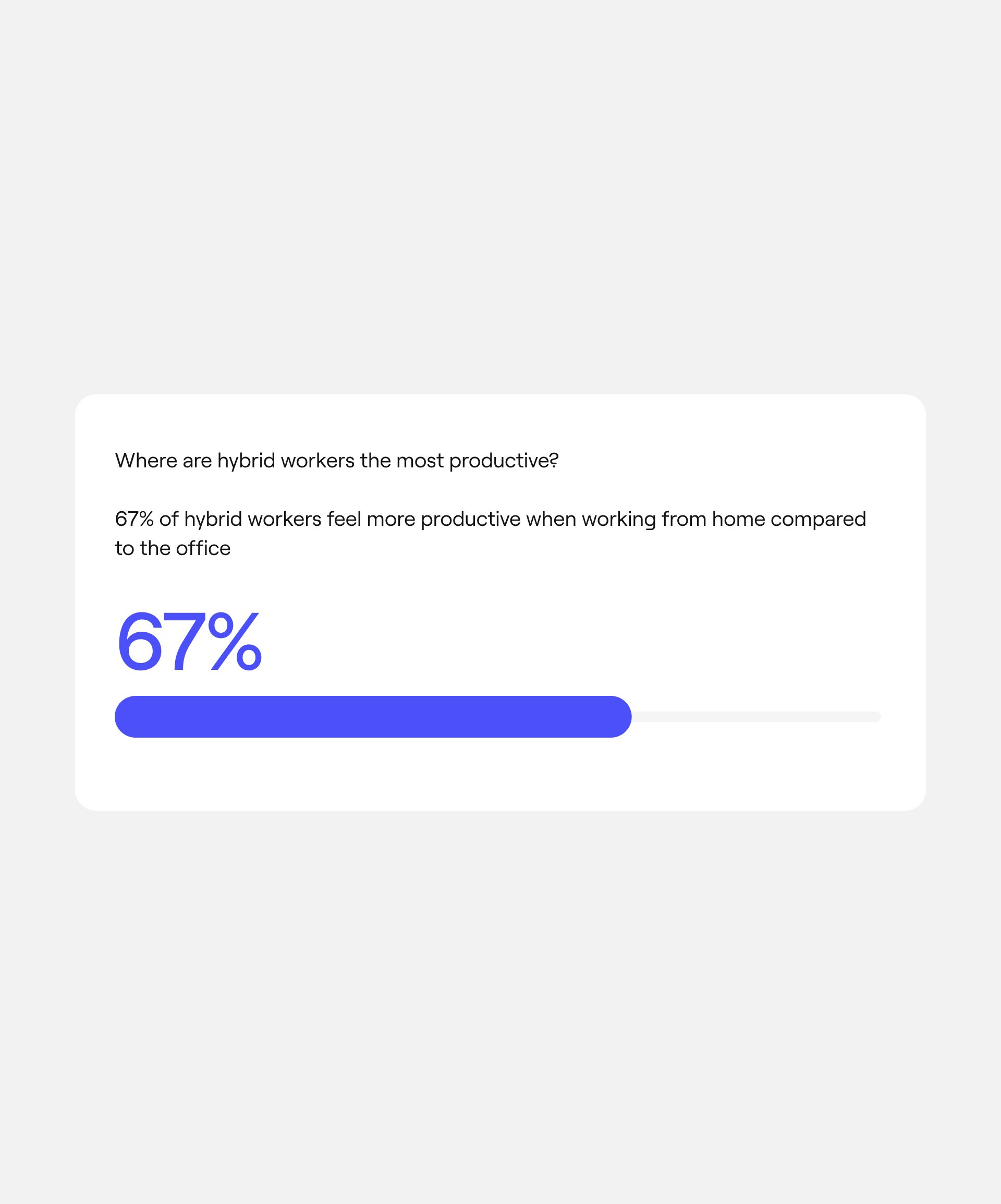
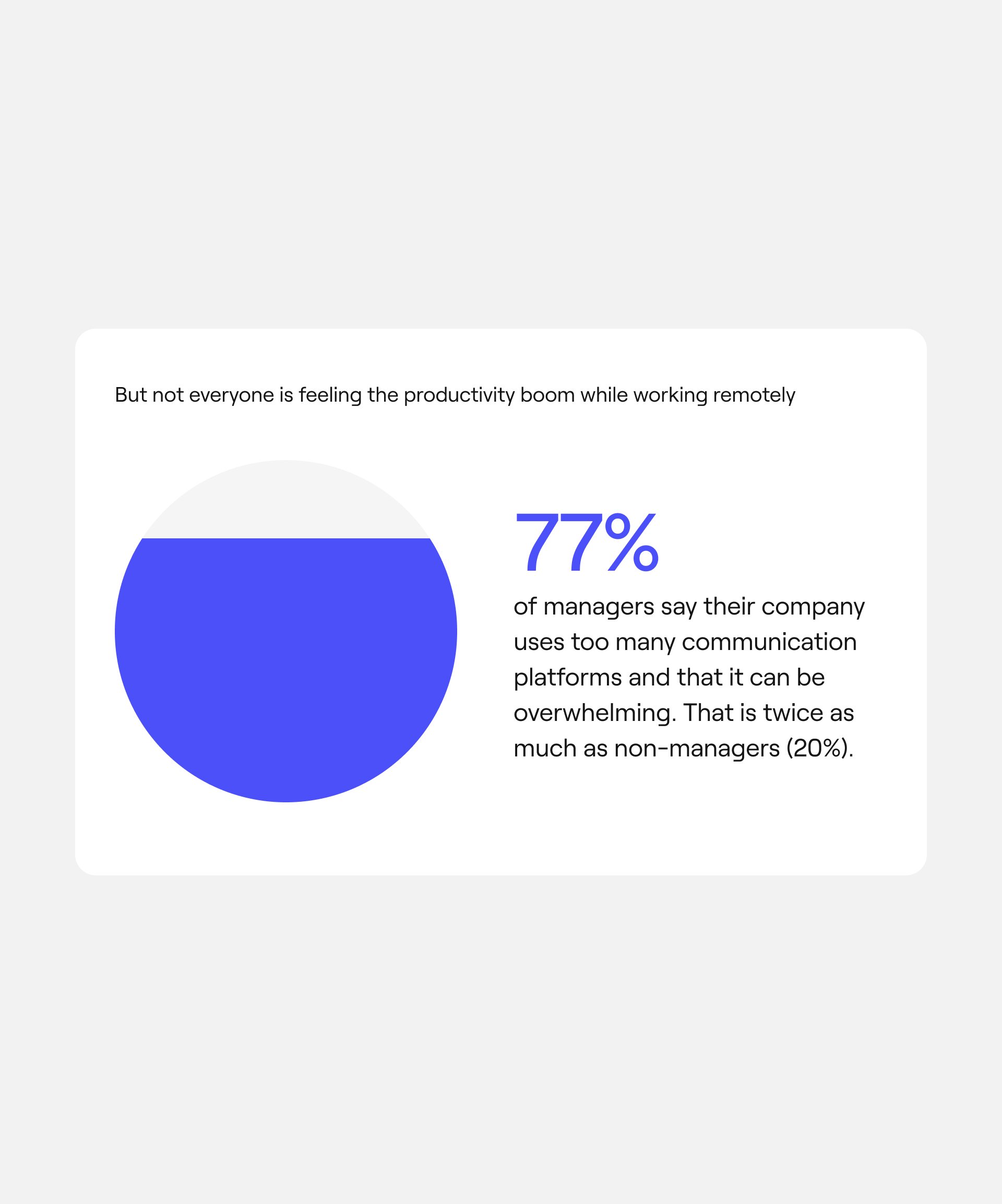
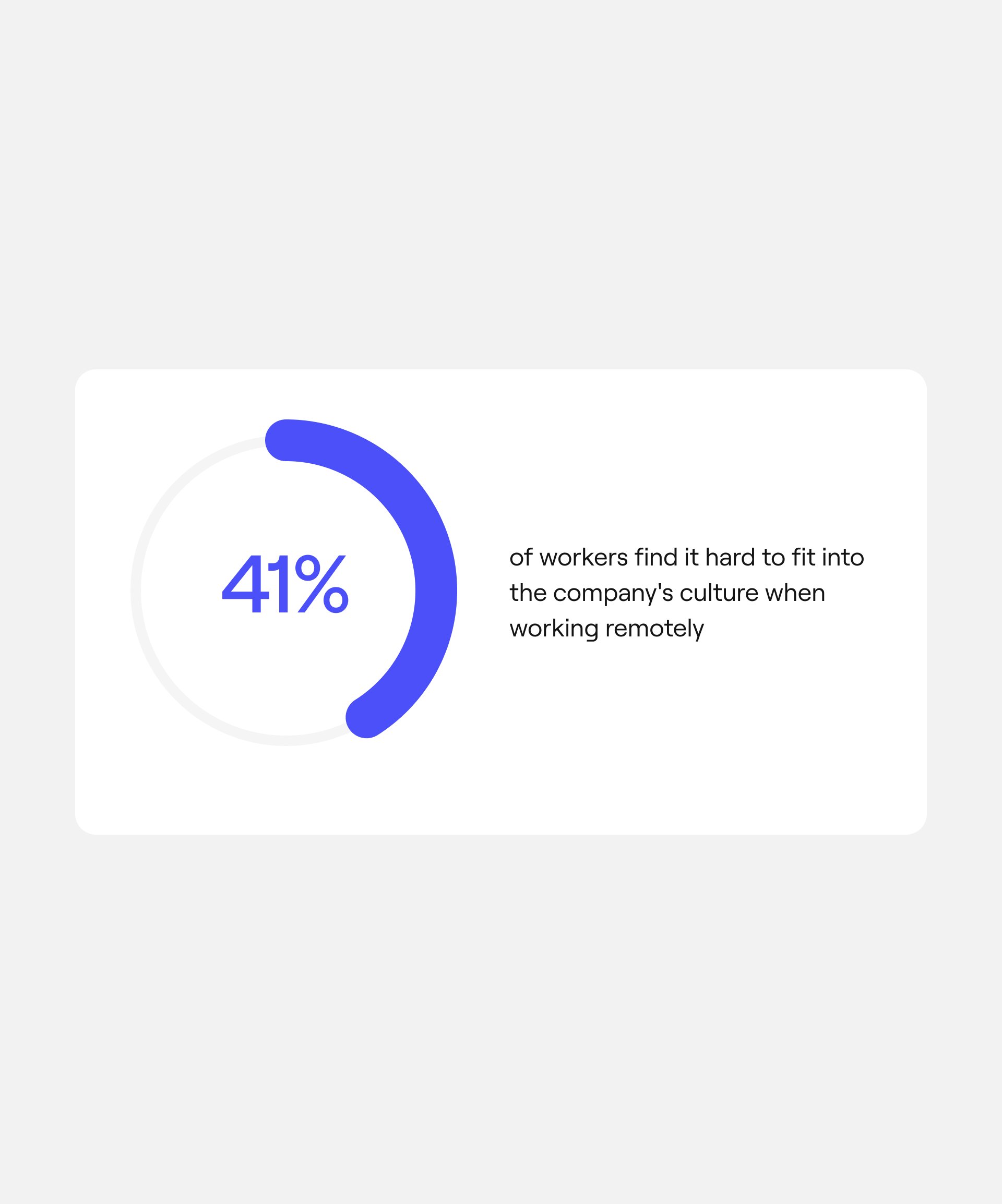
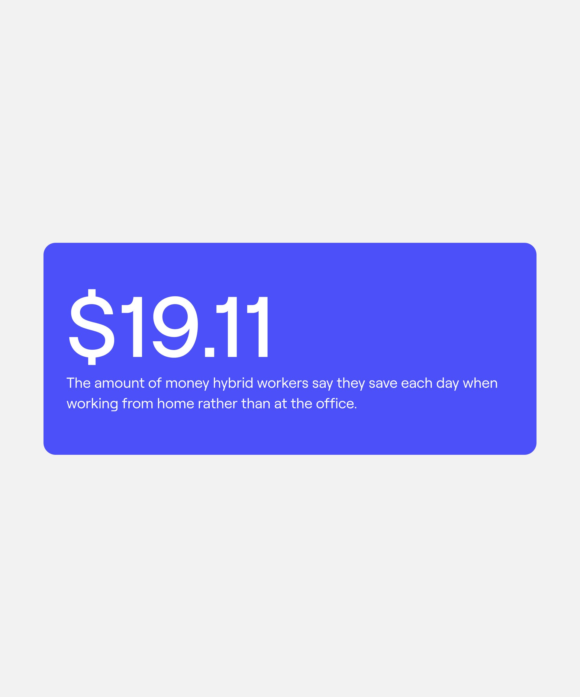
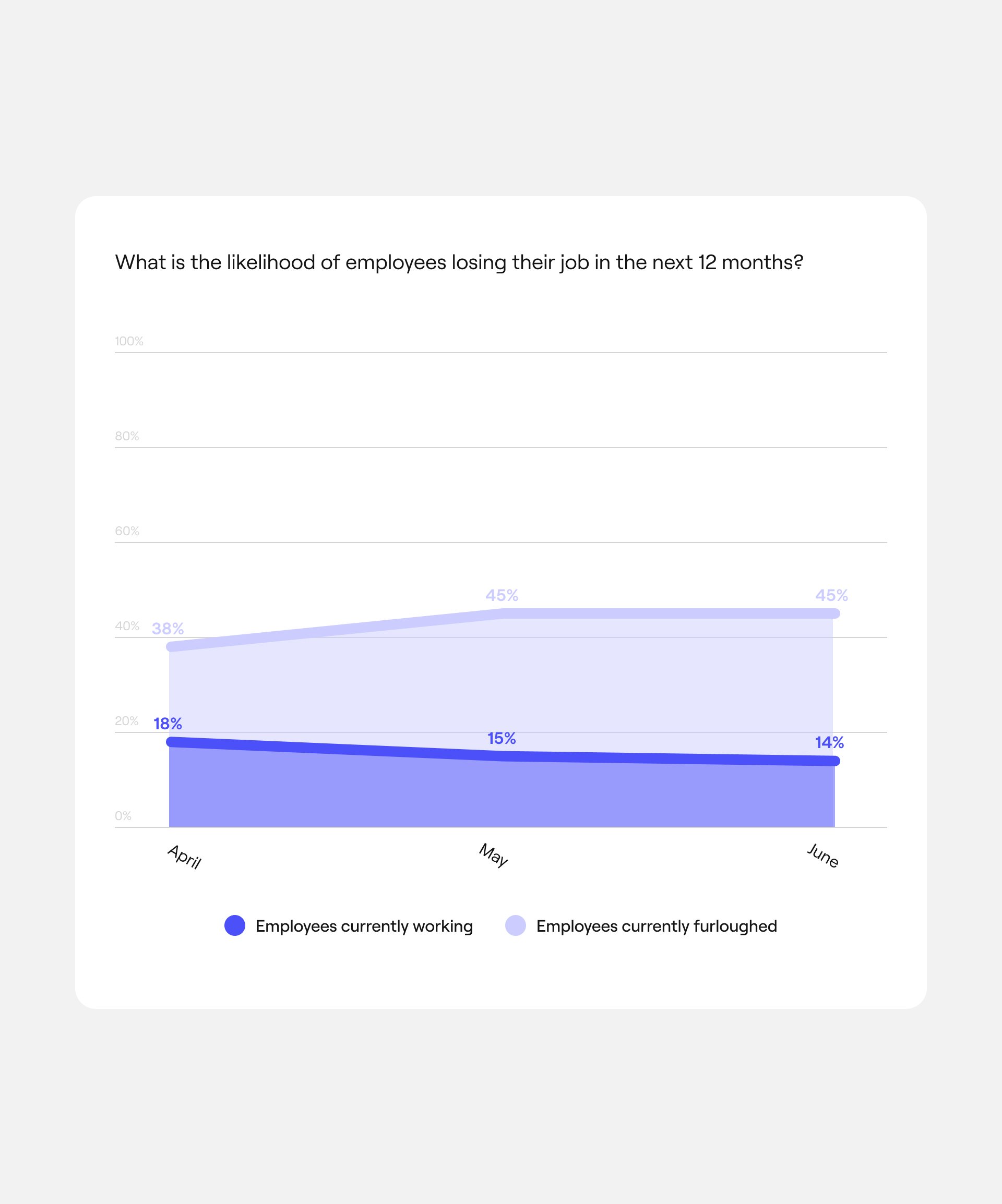
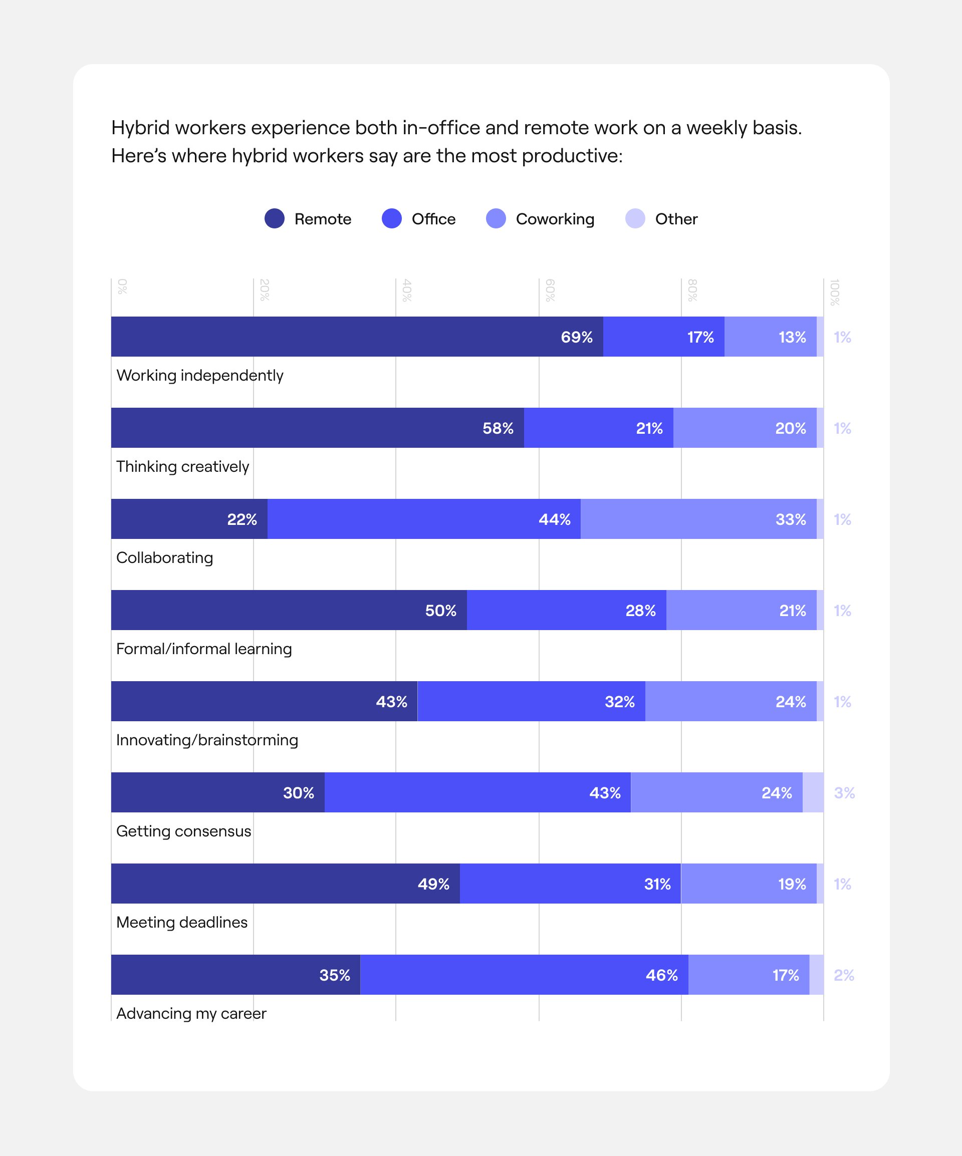
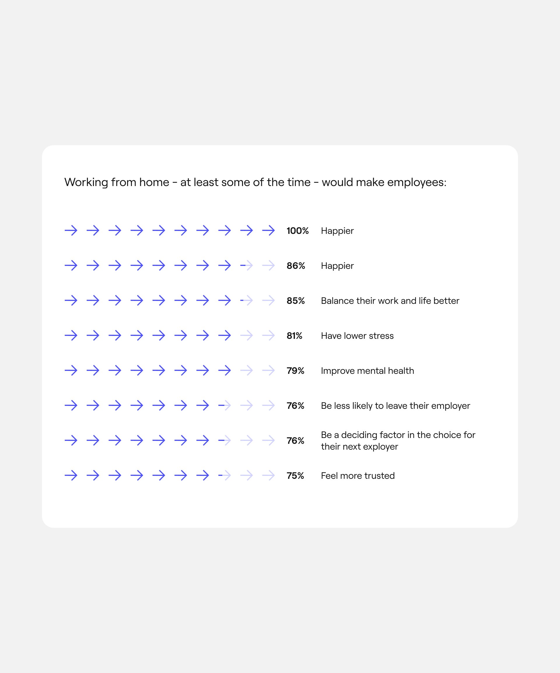
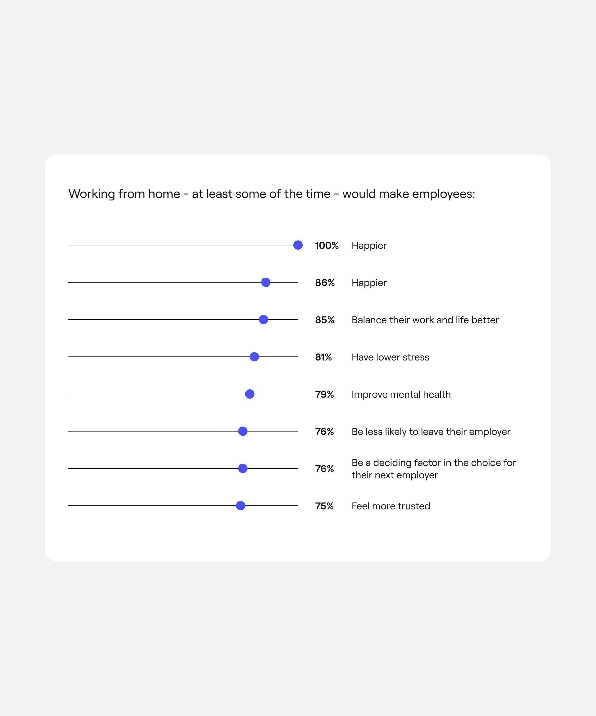
22+ standardized chart designs; web design and data visualization for State of Remote Work 2022 report
-
Standardization in service of scale, ease of dev implementation, and time saved
-
Senior Design Manager, Owl Labs
The toolkit
*Desktop styles only
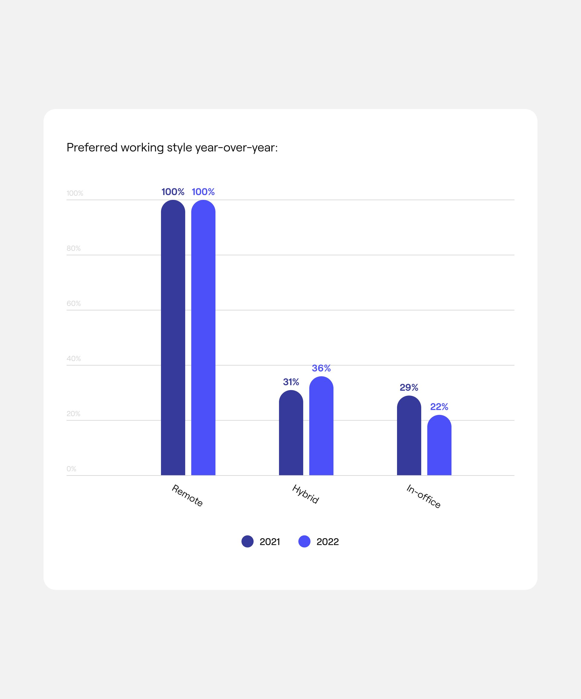
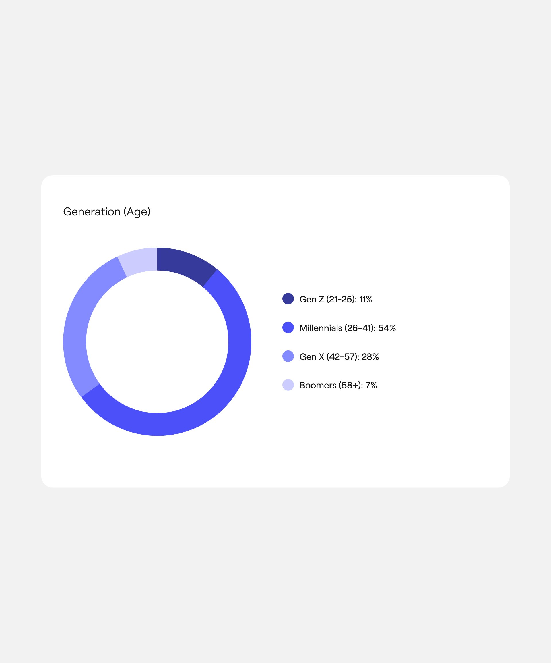
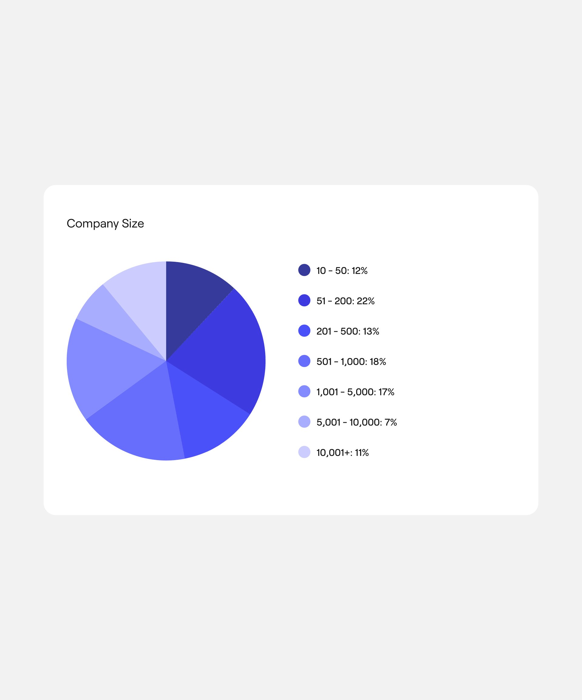
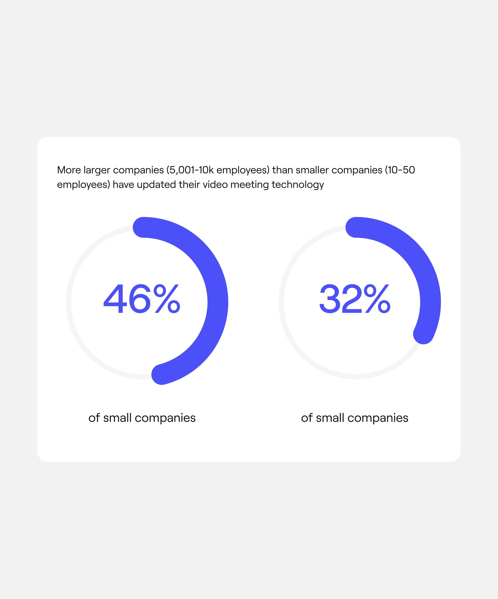
State of Remote Work 2022
“I was on a call with [a partner] team on Friday and they were GUSHING about how beautiful our data studies are.”
Kayt Racz
Copywriter